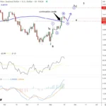
Since the election, markets have accelerated the pace of the advance as shown in the chart below.

The advance has had two main storylines to support the bullish narrative.
There is much to debate about the earnings recovery story but as I showed previously, and to steal a line from my friend Doug Kass, this “new meme increasingly resembles ‘Group Stink.’” To wit:
“Despite many who are suggesting this has been a ‘rational rise’ due to strong earnings growth, that is simply not the case as shown below. (I only use ‘reported earnings’ which includes all the ‘bad stuff.’ Any analysis using “operating earnings” is misleading.)”

“Since 2014, the stock market has risen (capital appreciation only) by 35% while reported earnings growth has risen by a whopping 2%. A 2% growth in earnings over the last 3-years hardly justifies a 33% premium over earnings.
Of course, even reported earnings is somewhat misleading due to the heavy use of share repurchases to artificially inflate reported earnings on a per share basis. However, corporate profits after tax give us a better idea of what profits actually were since that is the amount left over after those taxes were paid.”

“Again we see the same picture of a 32% premium over a 3% cumulative growth in corporate profits after tax. There is little justification to be found to support the idea that earnings growth is the main driver behind asset prices currently.
We can also use the data above to construct a valuation measure of price divided by corporate profits after tax. As with all valuation measures we have discussed as of late, and forward return expectations from such levels, the P/CPATAX ratio just hit the second highest level in history.”

The reality, of course, is that investors are simply chasing asset prices higher as exuberance overtakes logic.
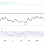
The second meme of “it’s all about tax cuts” is also not entirely accurate. The current rally, following the nearly 20% decline in early 2016 is actually an extension from the transition of “quantitative easing” from the Federal Reserve to the global Central Banks. What is clearly seen in the chart below is that as the Fed signaled the end of their QE program, and begin hiking interest rates, Global Central banks took the lead.