With less than a month left to go to close out the year, it’s a good time to reflect on the highs and lows that market participants have experienced. While the year began with a rocky start due to the Silicon Valley Bank collapse, the market continued to power forward, stumbling in Q3 as 10-year Treasury yields rose to a 15-year high, but recovering with a bang in November, with the S&P 500®
up 21% YTD.1 One consequence of rising Treasury yields was the surge in the U.S. dollar, which typically is a currency headwind for mega caps, as U.S. multi-nationals tend to gain most of their revenue from overseas. But that didn’t hamper the tear that mega caps were on this year, as Exhibit 1 illustrates, with the S&P 500 Top 50 outpacing the S&P 600®
by 28% YTD. While we recently saw a pullback in 10-year yields along with the dollar, with the S&P U.S. Dollar Futures Index down 2% in November, if that trend continues, that could potentially be a further benefit to mega-cap strength. 
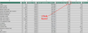
While small caps recovered in November, this year’s large-cap-led rally has been unusual in terms of its narrow breadth. We can visualize this in Exhibit 2, where we rank the historical annual S&P 500 returns in our database by skewness of constituent returns, as measured by the difference between the average versus median constituent return, and subsequently divide them into quartiles. Then we perform the same exercise, now ranking by skewness of constituents’ return contribution. So far this year, the average return has been greater than the median by 3.5%, in between the third and fourth quartile, while the average constituent contribution has been greater than the median by 3.7%, placed right below the fourth quartile level. These relatively extreme results are consistent with the concentration of outperformance within the Magnificent Seven stocks, which has been unusually high relative to history, and perhaps a headwind for more concentrated active managers that are underweight the largest stocks. 
Returning to the ascent of 10-year Treasury yields, the rise was not limited to the long end of the curve, with a significant climb in short-term Treasury yields on the back of Fed rate hikes to combat inflation. But as 10-year yields picked up steam, the inverted yield curve began to disinvert. At a sector level, Exhibit 3 shows that the momentum in Information Technology has continued despite the sector’s traditional sensitivity to higher rates, while Utilities, traditionally more bond-like in nature, is unsurprisingly the worst sectoral performer YTD. What is surprising is that while Financials should benefit from the disinversion of the yield curve, which can improve banks’ net interest margins, the sector has not managed to recover post the Silicon Valley Bank tumult and is the fifth worst sectoral performer YTD. 
In addition to spectacular equity performance, we witnessed a strong recovery in fixed income compared to last year’s abysmal performance, with the iBoxx Liquid Investment Grade up 8% in November, its best monthly return since December 2008. But while absolute performance has been rosy, risk-adjusted performance can be more challenging given continued positive correlations between equities and bonds, a natural outcome of gains across both asset classes. Meanwhile, despite China’s economic and real estate woes, with the S&P China 500 down 14% in USD terms year-to-date, Asian markets offered some solace, as we see in Exhibit 4, where a consistent negative spread in trailing 12-month volatility between the S&P Global BMI and S&P Global ex-Pan Asia BMI indicates Pan Asia has acted as a diversifier. 
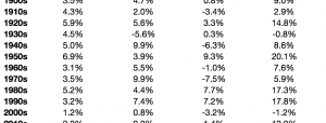
Putting risk into context, despite geopolitical tensions coupled with lingering inflation and recession concerns, Exhibit 5 shows that the market has been at ease, with the VIX®
trending downward in the past 12 months, ending November below the 13 handle. But what signal has low equity implied volatility given for future equity returns historically? We rank the same years in our database by VIX and divide them into three buckets based on a VIX level at year-end of less than 13, between 13 and 20, and above 20. Historically, we see a linear relationship between the year-end level of VIX and median subsequent year S&P 500 returns, indicating that, on average, years ending with higher implied volatility tended to be followed by higher returns.1 YTD as of Dec. 5, 2023.More By This Author:Who’s Naughty And Nice
Gold Hits All-Time Highs And DJCI Silver Tops 10% In November
Finding Fee Savings In Fixed Income