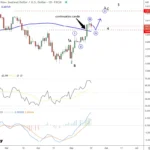
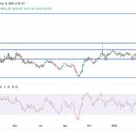
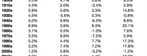
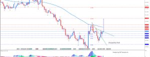
I’ll put up the final Coronavirus update of the year later today, but before we leave 2023, let me put up the graph that I think explains about 90% of the economic data this past year. And here it is: This was a graph I created, and included in a piece called “Why the Index of Leading Indicators failed.“Here’s the explanation: the situation just before the pandemic is lines S1, D1. The two rounds of stimulus pushed demand to the right (i.e., higher demand) even as supply tightness constricted (also acting to move prices higher) as shown in lines S2, D2.The subsequent relaxation of supply constrictions that began in 2022 and continued in 2023 pushed prices down to a point of equilibrium where demand is greater, shown at point S3, D3. This is in contrast to the normal expectation that commodity prices decline due to demand destruction, as shown by line S2 where it intersects with dotted line D4.Perhaps the biggest single component of this was the return of gas prices to their longer-term trend after the spike to $5 in the first half of 2022:
 In short: the story of the economy in 2023 was that lower producer prices generally, and at least one important decline in consumer prices, enabled higher consumer demand without igniting any further inflation.More By This Author:Jobless Claims End The Year On A Solidly Positive Note
Repeat Home Sale Prices May Be Easing Back Into Their Pre-Pandemic YoY Range
Completing The Housing Market Picture For November