Image Source: PixabayThe analysis below covers the Employment picture released on the first Friday of every month. While most of the attention goes to the headline number, it can be helpful to look at the details, revisions, and other reports to get a better gauge of what is really going on.
Current Trends
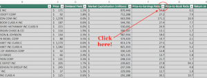
The BLS reported a gain of 175k jobs which was below expectations of about 200k. The Household Survey was high last month but came in way below the Headline report with only 25k jobs reported.  Figure: 1 Primary Report vs Household Survey – MonthlyEven with the blowout Household report last month, the Household report is coming in way below the Headline number. The chart below shows that this trend has been in place for a few years but has reached a new low this year at only 31.4% (see orange dots below). YTD the Household report has shown 308k jobs vs the Headline report of 982k.
 Figure: 2 Primary Report vs Household Survey – AnnualThe BLS also publishes the data behind their Birth/Death assumptions (formation of new business). In April, the BLS assumed 363k jobs added to their birth/death assumptions. This is the highest percentage of assumptions relative to the total raw job gains since December and the second highest in a year. This means almost half the job gains this month were due to the assumptions in the Birth/Death model.
 Figure: 3 Primary Unadjusted Report With Birth Death Assumptions – MonthlyThe annual view is even more divergent showing that raw jobs are -253k for the year. Without Birth/Death, that number drops to -625k because Birth/Death makes up with +372k.
 Figure: 4 Primary Unadjusted Report With Birth Death Assumptions – Monthly
Digging Into the Report
The 175k jobs surprised to the downside with the unemployment rate also rising slightly to 3.9%. Figure: 5 Change by sectorAnother level of detail in the Household report shows full-time vs part-time job holders. While part-time had been leading the way for months, April saw a big reversal where part-time jobs were replaced by full-time jobs.
 Figure: 6 Full Time vs Part Time
Jobs by Category
Several categories saw some big misses compared to recent averages. Only three categories were above the 12-month trend (Education, Trade, and Manufacturing). Figure: 7 Current vs TTMThe table below shows a detailed breakdown of the numbers.
 Figure: 8 Labor Market Detail
Revisions
Over the last three months, the data has been revised down by an average of 41.3k per month and 8.5k over 12 months. These are major revisions downward that go unnoticed by the mainstream. These downward revisions exist despite an upward revision for March. Figure: 9 Revisions
Historical Perspective
The chart below shows data going back to 1955. Figure: 10 Historical Labor MarketThe labor force participation rate is still well below the highs before the Global Financial Crisis. This month it stayed steady at 62.7%.
 Figure: 11 Labor Market Distribution
Conclusion
This jobs report was very weak. The Headline number fell short of expectations, there have been major revisions downward in recent months, much of the gains were based on Birth/Death assumptions, and the Household Survey showed a very big miss.More By This Author:Inflation Brewing: Is Coffee The Next Cocoa?
“Safe Haven” Yen Trending Towards Zero Against Gold
Something Else Is Driving Gold