The economy expands in terms of capacity utilization until the effective demand limit is reached. The following graph shows the effective demand limit. (link to data… https://fred.stlouisfed.org/graph/?g=eUj3)
The red link of effective demand stays above real GDP.
One thing to notice about the red line of effective demand is that after is bounces off of real GDP, it rises and then levels off at some level. This is seen between 2010 and 2014. The level sets the effective demand limit for the next time that real GDP marks a process of constraining capacity utilization.
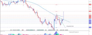
Here is another graph of my AS-ED model. Over the past 2 eyars, the down-sloping lines of effective demand are bunching together and setting up the effective demand limit between $17.1 and $17.4 trillion of real GDP.
If you can remember how the stock market hit a trouble spot back in 3rd quarter of 2014, a similar scenario is set for when real GDP reaches $17.1 and $17.4 trillion. At the current growth rate, real GDP looks to be about 2 to 3 quarters away from hitting the effective demand limit.
Experience is showing that it does not signal a recession, but a challenging period where markets need to re-order themselves.