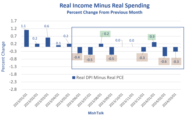
A deeper dive into personal income and outlays for March shows significant signs of consumer stress to maintain standards of living.  Real Income and spending data from the BEA, chart by MishThis is a follow-up with a couple new charts to my post on Friday, Personal Spending Jumps More than Income in March Income Minus Spending Chart Notes
Personal Income Four Ways  Understanding Personal Income
PCTR are government benefits that include Medicare, Medicaid, food stamps, Social Security, and disability payments. Personal Income and Real Hourly Wages  Income data from the BEA, hourly earnings from the BLS, chart by Mish Percentage Increases in Income and Hourly Earnings
Income includes wages and salaries, Social Security and other government benefits, dividends, and interest. Who’s Doing Well and Who Isn’t?Those dependent on wages and salaries alone have not fared well since the pandemic. That also includes many on government benefits.The asset holders (those with interest income, rental income, dividend income etc., are doing much better.On average, things look at least OK, if not good.But for millions of people struggling with food and rent on real hourly earnings that have gone nowhere in four years, the economy does not look OK. The CPI Rose Sharply in March Led by Shelter and Gasoline  The CPI rose 0.4 percent in March. Rent was up another 0.4 percent with gasoline up 1.7 percent. Together, the pair was about half of the total rise.Rent of primary residence, the cost that best equates to the rent people pay, jumped another 0.4 percent in March. Rent of primary residence has gone up at least 0.4 percent for 31 consecutive months! The “rents are falling” (or soon will) projections have been based on the price of new leases and cherry picked markets. But existing leases, much more important, keep rising.Only 8 to 9 percent of renters move each year. It’s been a huge mistake thinking new leases and finished construction would drive rent prices.More By This Author:Ford Loses $132,000 On Each EV Produced, Good News, EV Sales Down 20 PercentPersonal Spending Jumps More than Income in MarchExpect Big Negative Revisions To BLS Monthly Jobs In 2023, GDP Too